
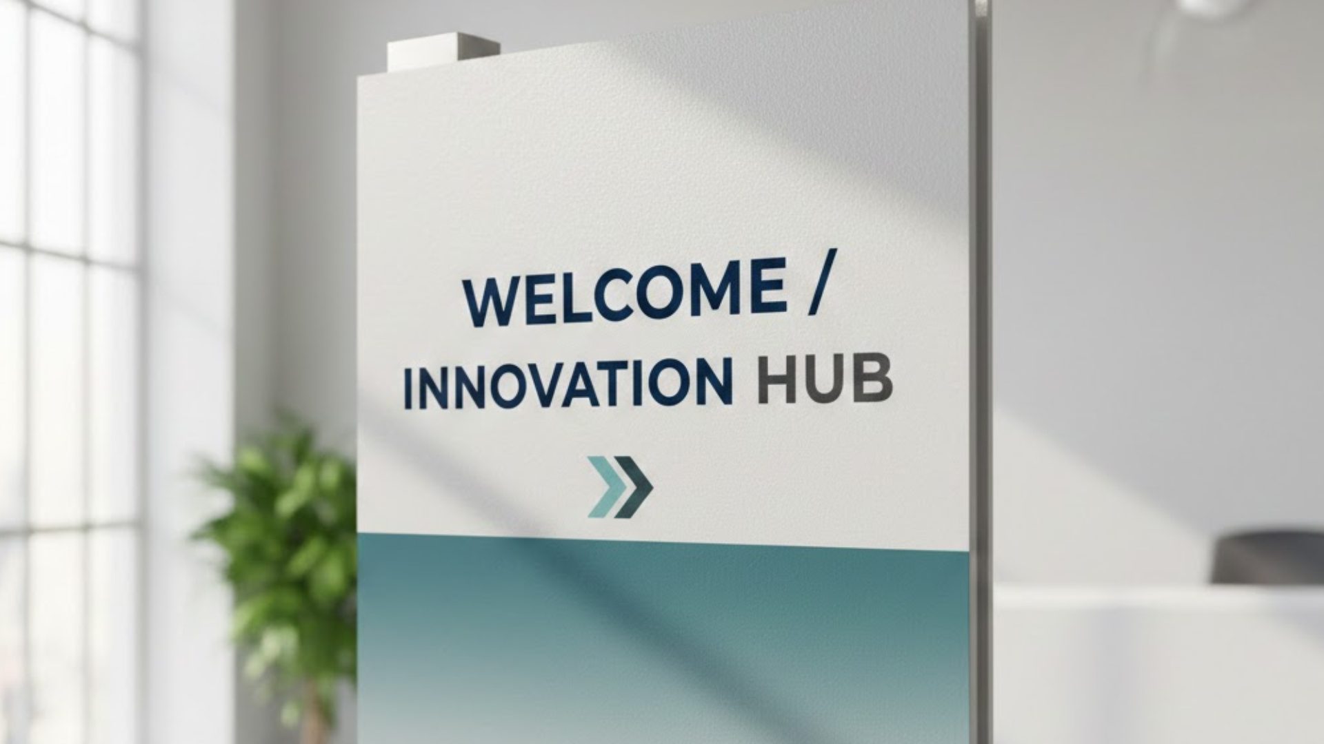
Flatbed Printing is one of the simplest ways to make signage look premium because the artwork is printed directly onto rigid materials instead of being printed separately and mounted later. If you want a quick overview of Big Sky’s capabilities, visit their main site.
What is flatbed printing, and why do businesses choose it for signage?
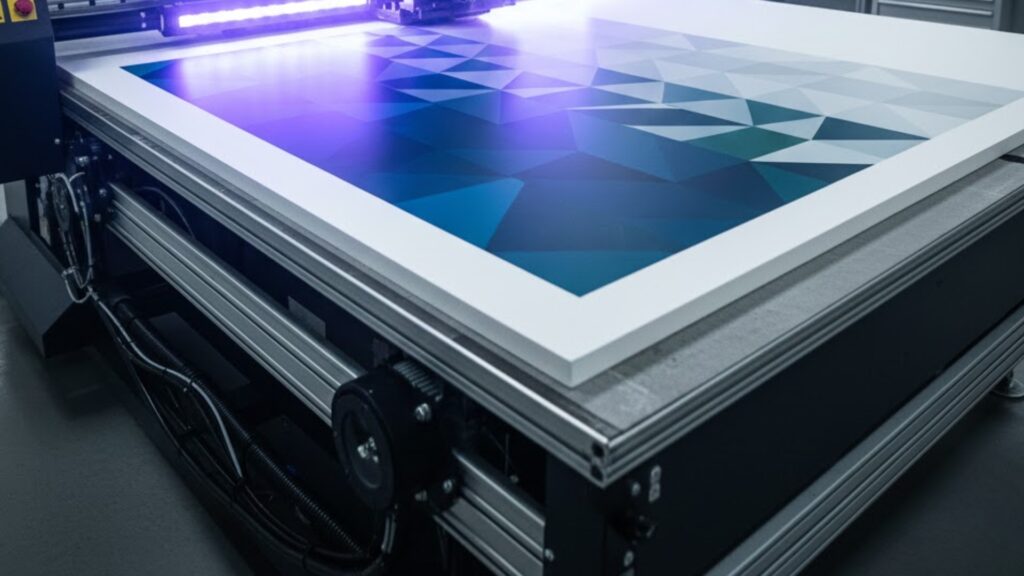
Flatbed printing is a rigid-substrate process where the material lies flat on a printer bed while the design is printed straight onto the surface. Businesses choose it because it produces clean, consistent results that hold up well in real-world use, especially for signage that gets viewed up close. The direct-to-substrate approach reduces common issues like tiny bubbles, slight skew, or edges lifting that can happen when a printed sheet is applied later, and those small flaws are what usually make signage look cheap.
Flatbed Printing: why does it make signage look high end without extra hassle?
Flatbed Printing often looks more premium because the workflow is simpler and more controlled. Fewer steps means fewer chances for handling marks, alignment errors, or finishing problems. The result is usually crisper text, smoother solids, and sharper edges, which translates into signage that feels intentional and professionally produced. When the piece looks clean at one meter and still looks clean up close, it immediately reads as high value.
Which rigid materials give the most premium look?
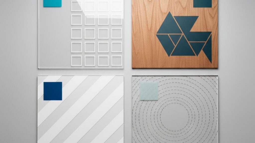
The best substrate depends on the visual vibe and the environment. Acrylic-style panels tend to feel modern and sleek, wood surfaces feel warm and boutique, glass can feel architectural and luxe, and rigid boards can be a strong value option for promotional and directional signage. If you want a dedicated service reference for typical applications and expectations, use Flatbed Printing as the baseline when planning your job.
How do you choose the right material for indoor vs outdoor signage?
Start with where the sign will live and how long it needs to last. Indoor signage can prioritize appearance, finish, and a premium feel, while outdoor signage must consider weather exposure, sunlight, and frequent handling. Then think about viewing distance and touch points: a close-viewed sign needs sharper detail and cleaner finishing than something seen from across a parking lot. If you are unsure, brief the location, expected lifespan, and mounting approach so the production choice matches real use instead of guesses.
What makes a sign look expensive besides print quality?
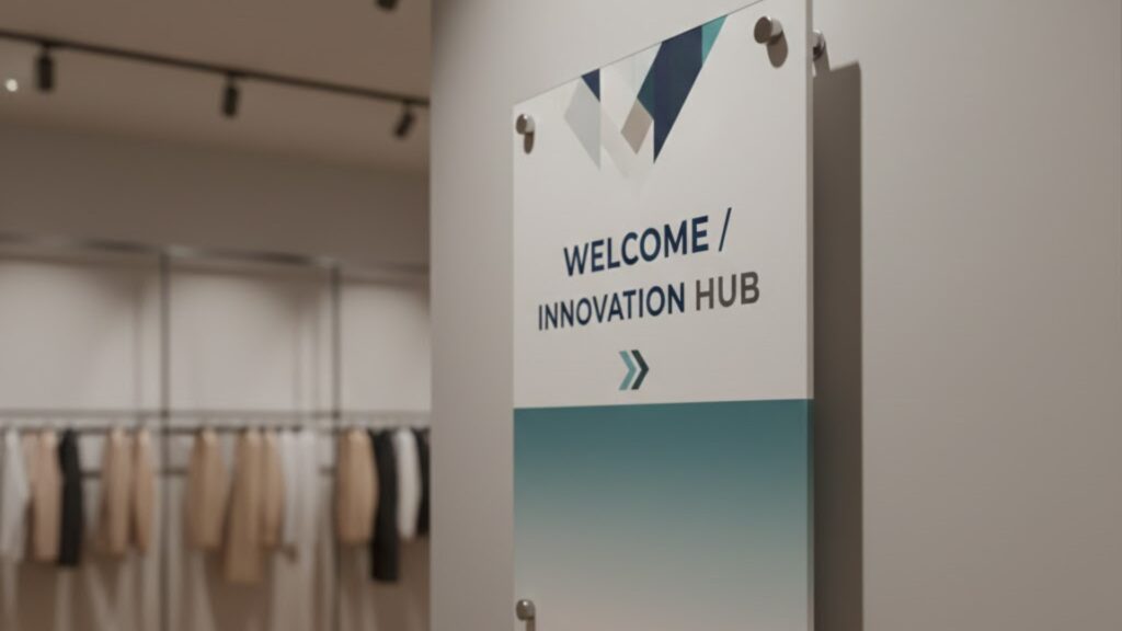
High-end signage is usually a combination of print clarity, clean edges, accurate alignment, and installation that looks deliberate. Even the best artwork can feel average if corners look rough, the piece is mounted slightly crooked, or the spacing is inconsistent across multiple panels. Treat finishing and installation as part of the design, not an afterthought, and you will get a result that looks like it belongs in the space.
What file-prep mistakes make good designs print badly?
Most disappointments come from file issues, not from the printing method. Avoid sending low-resolution images, unclear versions, or artwork that is not built at the final size. Keep important text away from edges and any mounting points, include bleed if backgrounds run to the edge, and ensure brand elements stay consistent across all pieces. If shape cutting is needed, include a clearly labeled cut path so the final product matches the design rather than getting interpreted differently.
How do thickness and mounting change the final feel of signage?
Thickness and mounting can make the same design feel either temporary or premium. Thicker panels usually feel more solid, stay flatter, and look more intentional on larger installations. Mounting also signals quality instantly: stand-offs and hidden fixings often look deliberate and high-end, while exposed screws can look temporary unless they are aligned perfectly and clearly part of the design language. Plan mounting early so holes, spacing, and clearances are correct the first time.
What finishing options turn a standard panel into a premium piece?
The upgrades people notice most are the ones that look clean at a glance and flawless up close: precision cut-to-shape, smooth corners, accurate holes for stand-offs, and consistent edge finishing. Custom shapes, internal cut-outs, and repeatable components are where precision really pays off. For projects that need that level of accuracy, Big Sky’s related capability is Digital Cutting, which helps you move from basic rectangles to purpose-built signage components.
How do UV inks and curing affect durability and turnaround?
Many flatbed workflows use UV curing, which sets ink quickly so production can move into finishing sooner and the printed surface can handle better during installation. In practical terms, proper curing supports a cleaner finish, reduces the risk of handling marks, and helps prints stand up to light cleaning over time. If you want the technical background, see Ultraviolet curing on Wikipedia.
How do you brief Big Sky so the quote matches what you actually want?
A tight brief prevents surprises and reduces reprints. Include final size, quantity, indoor or outdoor placement, preferred material (or the look you want), deadline, finishing needs (cut-to-shape, holes, edge finish), and mounting style, then attach print-ready files or clear artwork notes. If the job is part of a broader signage setup, mention that upfront so everything stays consistent. When you are ready to scope and schedule, use Contact Us so all details are captured in one place.