

Printed Glass can turn an ordinary wall, window, or counter area into a premium branded feature because it combines a high-end surface with crisp, permanent-looking graphics. For service details and examples, start with Printed Glass.
What is printed glass, and why does it instantly feel premium?
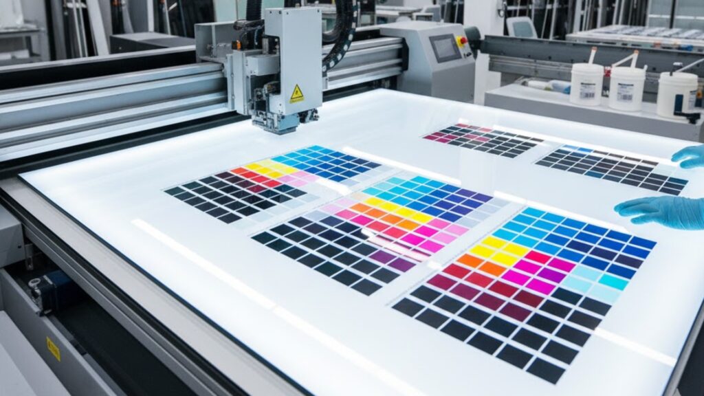
Printed glass is glass that has graphics applied directly to the glass surface using professional printing methods, creating a sleek, modern finish that looks far more expensive than a standard poster or vinyl stuck to a wall. The reason it feels premium is simple: glass reflects light, looks clean when installed properly, and signals quality the moment someone walks into the space. When the design is sharp and the placement is intentional, it reads like an architectural feature, not an afterthought.
Printed Glass: where does it work best in real spaces?
Printed Glass works best where people naturally look or pause, like reception desks, entryways, meeting room partitions, feature walls, and retail counter zones. It also works well in hospitality environments where you want branding that feels subtle but upscale, such as behind a bar, in a lobby, or near a check-in point. The key is choosing a placement that supports the experience, so the branding feels integrated into the space rather than pasted on top of it.
How do you choose between a bold brand statement and a subtle premium accent?
Start with the job the feature must do. If it is meant to anchor the brand in the space, go bold with strong contrast, a large logo mark, and a clear message that reads from a distance. If it is meant to elevate the environment without shouting, use tone-on-tone patterns, frosted-style effects, light textures, and minimal wording so the glass feels like part of the interior design. A good rule is: bold for wayfinding and first impressions, subtle for spaces where people stay longer.
What design choices make printed glass look expensive instead of busy?
Keep the layout clean and intentional, and treat empty space as part of the design. Use a limited colour palette, consistent spacing, and clear hierarchy so the eye knows where to look first. Avoid tiny detail that disappears at distance, and avoid cramming too much text into the feature. Premium printed features are usually simple, confident, and easy to understand in two seconds.
What lighting and background issues can ruin the final look?
Glass reacts to light, which means glare, reflections, and background clutter can reduce readability if you do not plan for them. Bright windows behind the piece can wash out a design, and harsh downlights can create hot spots that hide key elements. Plan around the real lighting at the time customers will see it, and consider using stronger contrast or a more controlled design if reflections are unavoidable. The goal is for the print to stay legible and sharp from the main viewing angles, not only in perfect lighting.

How do you decide between glass, wood, and other premium substrates?
Glass gives a modern, clean, architectural feel, while wood tends to feel warm, textured, and boutique. If your brand leans minimal and modern, glass often fits better. If your brand leans natural and handcrafted, wood may carry the vibe more naturally. If you want to compare directions, Big Sky also offers Printed Wood, which is useful when you want a premium look with a softer, warmer finish.
How can you combine printed glass with signage so the whole space feels branded?
Think in a system, not a single piece. Use printed glass as the hero feature, then support it with consistent signage elements like directional signs, wall panels, or display pieces that share the same colours, typography, and spacing rules. This makes the space feel designed end-to-end, which is what creates the premium impression. If you want a full signage approach rather than a one-off print, use Custom Signage as the broader solution reference.
What production and installation details matter most for a clean finish?
The premium result usually comes down to alignment, clean edges, correct mounting, and careful handling. The glass must sit straight, the spacing must be even, and the install method should look intentional, not improvised. Plan cable routes, fixings, and clearances before production so you do not end up making compromises on the day of installation. If the feature includes brackets, supports, or integrated elements, Big Sky’s Fabrication capability can be relevant for building a clean, durable final assembly.

What should you send in your brief so the first proof is close to perfect?
Send the final size, where it will be installed, the viewing distance, lighting notes, and whether the goal is bold branding or a subtle premium accent. Include your brand assets, colour references, and any examples of the look you want. Also state the deadline, whether you need mounting hardware, and whether the glass will be cleaned often, because that can influence the best approach. If you want the technical background on glass as a material, Wikipedia’s overview of glass is useful, but your brief should focus on real-world placement and the finish you want people to notice.
How do you get pricing and next steps without wasting time?
To get an accurate quote quickly, include quantity, sizes, install location, timeline, and any mounting or fabrication requirements, then attach your artwork or ask for guidance on preparing it correctly. If it is part of a wider rollout, mention that so everything stays consistent across materials and future reorders. When you are ready to scope it properly, use Contact Us to send the details in one place.