

Printed Wood is a modern way to create warm, high impact signage that feels premium and inviting, especially in spaces where you want branding to look designed rather than stuck on. For service details and examples, start with Printed Wood.
What is printed wood, and why does it feel more premium than standard signage?
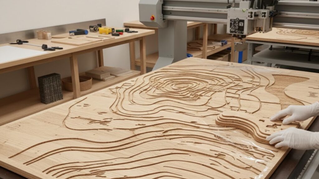
Printed wood is wood or wood-based panels printed with graphics directly onto the surface, combining the natural texture of timber with crisp branding. It feels more premium because wood carries natural warmth and depth that flat plastic or paper signage usually cannot match. When the design is clean and the finish is right, the grain subtly elevates the look and makes the branding feel integrated into the space rather than added as an afterthought.
Printed Wood: where does it work best for high impact signage?
Printed Wood works best where people are close enough to appreciate the texture, like reception areas, feature walls, retail displays, point-of-sale zones, cafés, studios, and boutique interiors. It is also great for brand moments that need to feel authentic and established, like “heritage” style branding, product storytelling walls, or menu and pricing boards that need to look crafted rather than disposable. The best placements are high-visibility areas where the sign becomes part of the interior design.
How do you choose the right wood type or panel for your intended look?
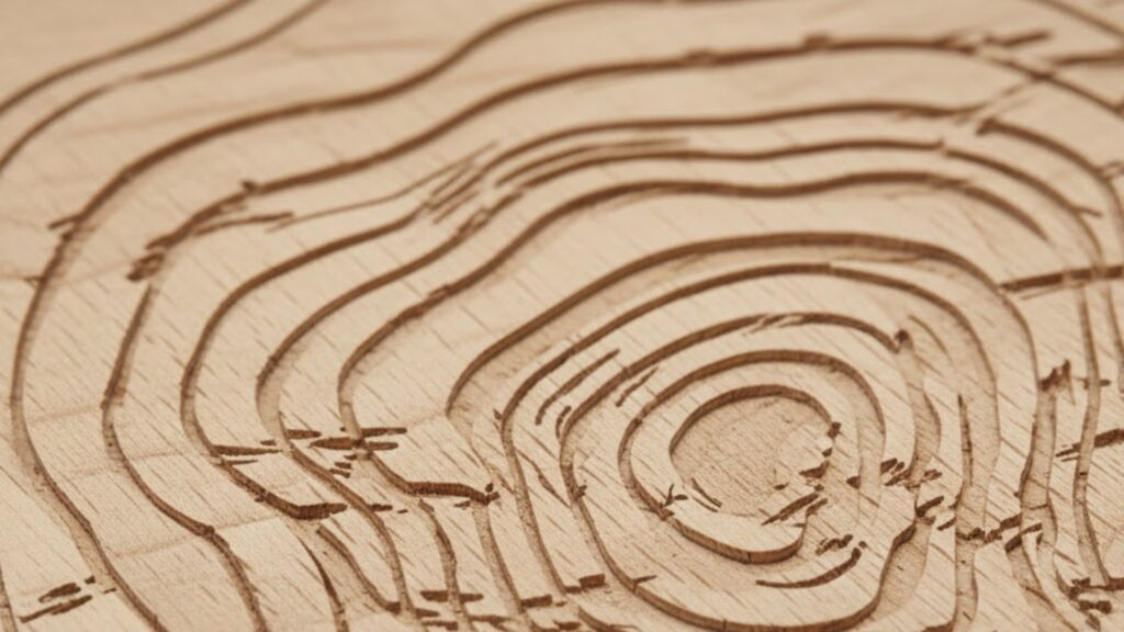
The first decision is whether you want visible grain and character or a cleaner, more uniform surface. Natural timber and textured surfaces can look incredible but they influence how colour appears, while smoother engineered panels can give more consistent colour and sharper small details. Your choice should match the brand: rustic and natural brands often benefit from a more visible grain, while modern brands might prefer a smoother finish that still reads warm but stays clean and minimal.
How does wood grain affect colour, contrast, and readability?
Wood grain and tone can shift how colours are perceived, especially lighter colours and subtle gradients. Dark wood can reduce readability for dark text, while warm-toned wood can slightly change the feel of whites and light greys. The best approach is to design with strong contrast and avoid relying on ultra-fine detail unless you are using a smoother panel. If readability matters, treat the wood as part of the colour palette and build the design to work with it, not against it.
What design rules make printed wood look expensive instead of messy?
Keep the layout clean, use fewer typefaces, and let the material do some of the work. Premium printed wood signage usually has strong hierarchy, generous spacing, and confident simplicity. Avoid clutter, avoid packing in too much copy, and keep the message easy to understand at a glance. If you want a high impact look, go larger with fewer elements rather than smaller with more elements, because wood shines when the design gives it room.
When should you choose printed wood instead of printed glass or rigid boards?
Choose printed wood when you want warmth, texture, and a crafted feel that fits natural or lifestyle environments. Choose glass when you want a sleek, modern, architectural feel and you are confident you can manage reflections and lighting. If you want to compare, Big Sky also offers Printed Glass, which suits brands that lean modern and minimal. If budget and speed matter most for short-term promos, rigid boards can be better, but they usually do not carry the same premium interior vibe as wood.
How can you combine printed wood with other signage so the space feels cohesive?
Use printed wood as your hero feature, then support it with consistent signage that shares typography, spacing, and colour rules across the rest of the environment. That could include smaller directional pieces, counter signage, or display elements that repeat the same brand system so the whole space feels designed. If you need a broader signage solution beyond one-off prints, use Custom Signage as the reference point for planning a full set that matches.
What finishing and edge details matter most for a premium result?
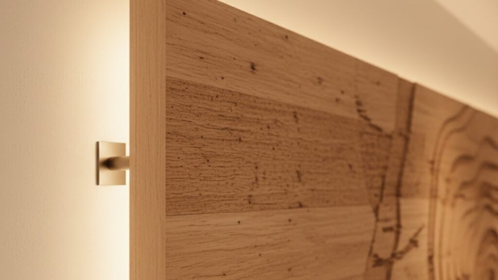
Edge finish is one of the fastest tells of quality. Clean, smooth edges and consistent corners make the piece feel purpose-built, while rough edges make it feel DIY. If the job needs custom shapes, internal cut-outs, or repeatable components, precision cutting helps the whole piece look engineered and clean. Big Sky’s related capability for accurate shaping is Custom Cutting, which is useful when the final sign needs more than a standard rectangle.
How do you brief your printed wood job so the first proof is close to perfect?
Include the final size, where it will be installed, the viewing distance, and the exact feel you want: rustic, modern warm, luxury boutique, or bold retail. Mention lighting conditions because warm light can amplify the warmth of wood and change how colours read. Include brand assets, reference images, and notes on whether the piece will be handled or cleaned often. For the technical background on wood as a material, Wikipedia’s overview of wood is a useful reference, but your brief should focus on the real-world look, placement, and finishing you want people to notice.
How do you get pricing and next steps quickly?
To get an accurate quote fast, include quantity, sizes, timeline, and any cutting or mounting requirements, then attach print-ready artwork or ask for guidance on preparing files correctly. If this is part of a bigger rollout, mention that so future reorders stay consistent across materials and finishes. When you are ready to scope it properly, use Contact Us to send all details in one place.